Update as of February 2021: If you look at the tutorial, please note that we have changed the placement of the reporting widgets in eMarketeer. They now have their own tab called “dashboard” when you enter a campaign. Other than that, setting up widgets works just as shown in the video.
In this article you learn:
- How the campaign report dashboard works
- A description of all reporting widgets and how to set them up
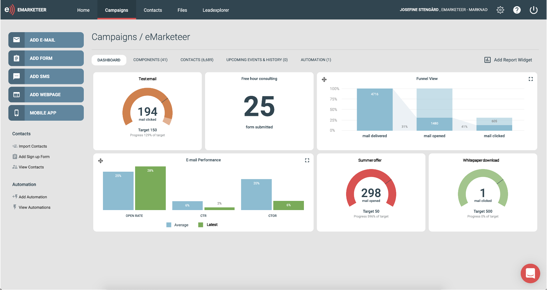
Campaign dashboard
With the campaign dashboard, you can use different reporting widgets to build reports that suit your campaigns. The reports are updated in real-time and you decide the look of it with the simple drag-and-drop feature.
To build a campaign report
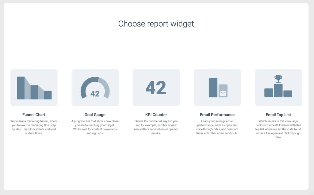
Go to the eMarketeer campaign you’d like to build a report for. Click the tab called “dashboard” and click the button that says “add reporting widget.” You now have different widgets to choose from to add to your report (see below for further explanation on these). You can pick as many as you’d like to track your campaign’s performance. You can also easily rearrange the widgets with the simple drag-and-drop feature.
Reporting widgets
The available reporting widgets are email top list, email performance, funnel chart, KPI counter, and goal gauge. Below, you find more details on what they mean and how you can set them up.
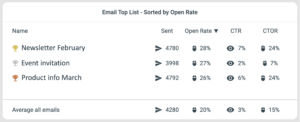
Email top list
Find out which of your email send-outs performs the best
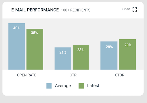
Email performance report
Suited for your email marketing
Funnel chart
Works well for lead nurture campaigns and events
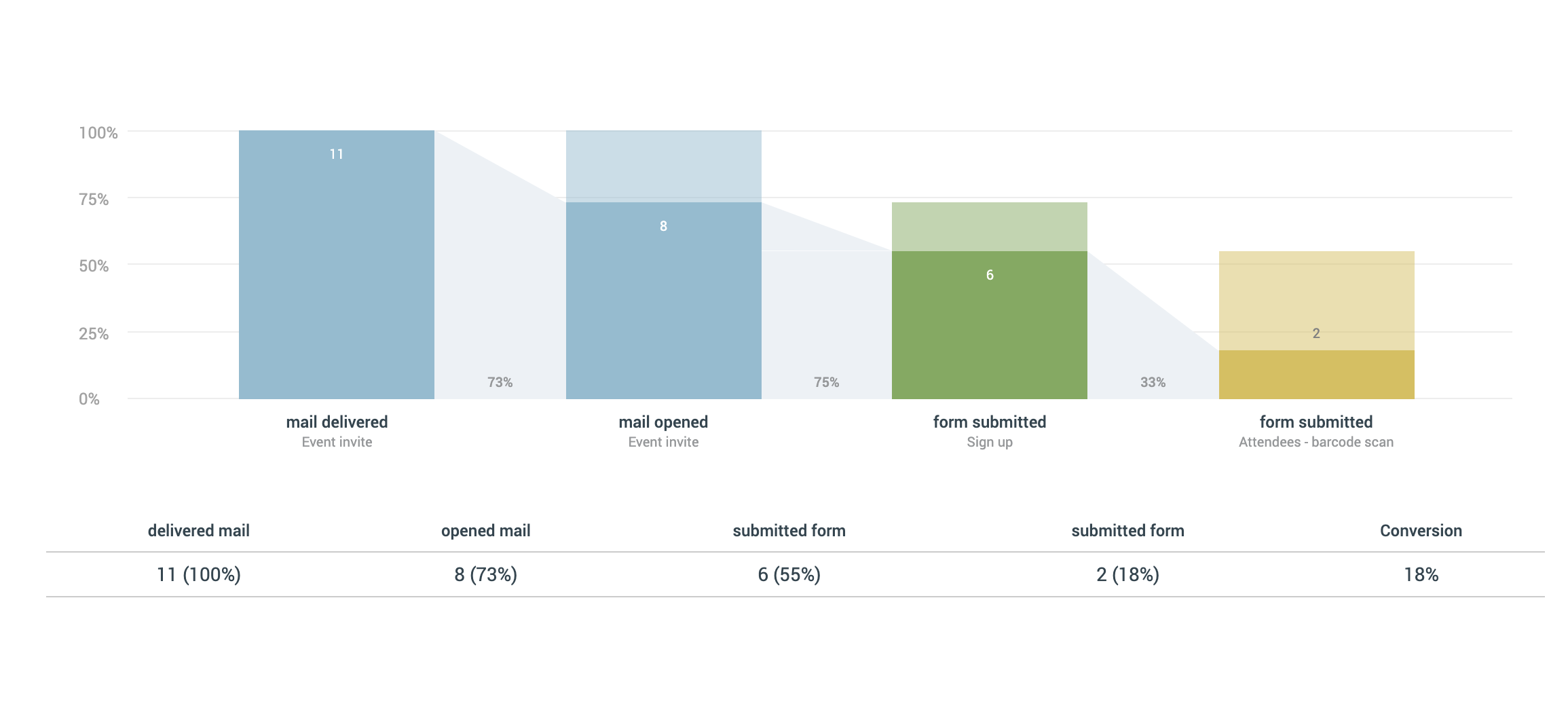
Track your marketing flow step by step.
The funnel chart works just as a marketing funnel. Here you can track each step in the flow you built and see how many convert to the next step and how many drop off, for example, for the first event invitation, to event sign up to attendee form. Each of these steps would be visualized in their own bar along with the conversion rate between each step. You also get the overall conversion rate, from the first component to the very last. It’s very easy to set it up:
- Click “add campaign reports”
- Choose “funnel chart”
- Choose the component that’s the first step in your flow. Depending on the type of component you choose, you can pick a couple of different actions. For example, for emails, you could track addressed, delivered, opened, and clicked. For forms, you can choose submissions.
- Add all the steps you have in your flow. You can set up as many as you’d like. Remember, that it has to be in the correct order in terms of your flow, from start to finish.
When you click a bar, you can see which contacts did or didn’t do the step. Under the bar, you can click the name of the component to see the report for that specific component.
Important to know: for a contact to be counted in a step, it must be a part of the previous step.
The funnel chart can be changed in size. If you’d like it to be smaller so you have room for another chart (for example the goal gauge) right next to it, open the funnel chart. Find the drop-down menu that says “size” and choose a lower number. You now have more space to add one of the charts below.
Goal gauge
Works well for downloads or sign-ups
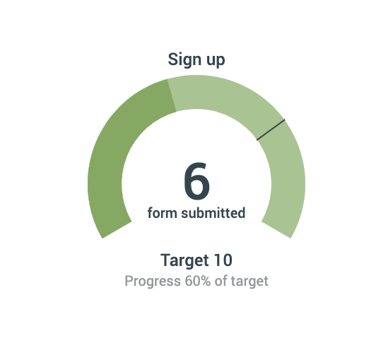
Set a target and see how close you are to reaching it.
The goal gauge works as a progress bar, where it’s visualized how close you are to reaching your target. You also see how many percent you are from reaching that target. This one is set up within seconds.
-
- Click “add campaign reports”
- Choose “goal gauge”
- Choose the component you want to track, for example, form submissions
- Set the target you have
- All done!
KPI counter
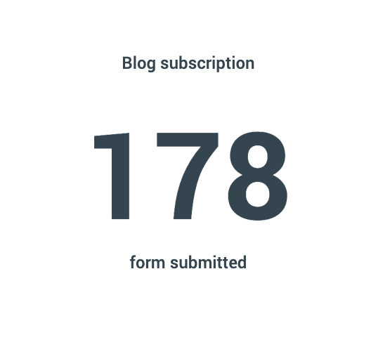
Get a quick look at how many people filled out a form, clicked an email, or whatever you’d like to track.
This one is similar to goal gauge, but, as the name implies, is simply a counter. In other words, you don’t set up a target. You could, for example, use this for new email subscribers.
- Click “add campaign reports”
- Choose “KPI counter”
- Choose the component you want to track, for example, form submissions
- The KPI is calculated right away.